
The shift towards darker earthier interiors: finding balance through feng shui

For years, light neutrals dominated residential interiors. White walls, pale woods, and cool gray finishes created spaces that felt clean and open. Today, we are seeing homeowners embrace something richer: deep browns, olive greens, charcoal, clay, burgundy, tobacco, and natural wood tones that bring warmth and depth back into the home.
But designing with darker colors requires balance. A room can feel warm and intimate without becoming visually heavy, and this is where Feng Shui offers another way of thinking about the space. Rather than viewing Feng Shui as a decorating style, we use its principles to consider how color, material, light, contrast, and energy work together so the finished space feels as supportive as it is beautiful.
Why Earthier Colors Feel So Appealing Right Now
Part of the movement toward deeper palettes is a response to interiors that have felt increasingly bright, white, and minimal. Homeowners are looking for warmth, and natural wood, stone, plaster, clay, and richly colored textiles introduce character and variation that can make a home feel more inviting and established.
Earthier colors also create a visual connection to nature. Browns recall wood and soil, greens reference plant life, muted reds and terracotta bring in the warmth of clay, and stone tones create a quiet, grounding foundation. Unlike some color trends that can quickly identify when a room was designed, many of these shades have existed in interiors for generations. Used thoughtfully, they can create a sense of permanence rather than novelty.
Darker colors can also produce a cocooning effect. In a bedroom, den, dining room, or another space where intimacy is desirable, that sense of enclosure can be incredibly comforting. The key is knowing how to balance it.
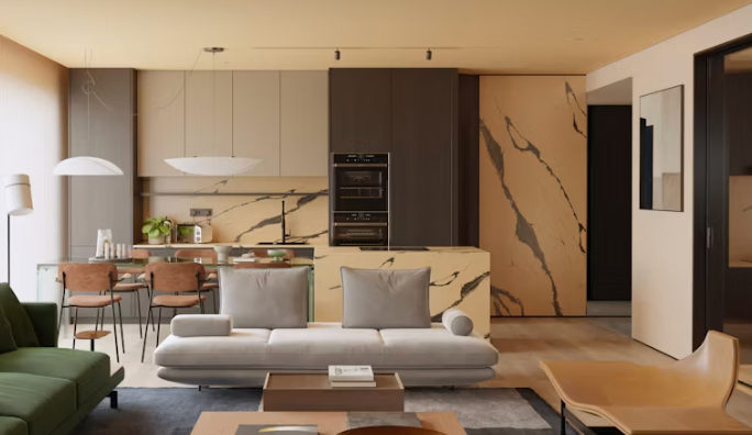
Looking at a Darker Palette Through the Five Elements
One of the tools we use in Feng Shui is the Five Element Theory. Wood, Fire, Earth, Metal, and Water each represent different qualities of energy, and all five can be expressed through color, material, shape, and texture.
When working with a darker, earthier interior, thinking about these elements can help prevent the palette from becoming one-dimensional.
Wood can be introduced through walnut, oak, green tones, plants, and other natural materials. In a darker room, wood brings warmth and an important connection to nature.
Fire does not have to mean bright red. Terracotta, burgundy, warm lighting, candles, and brass accents can all introduce Fire energy. These elements are especially useful for bringing warmth and movement to deep brown or charcoal palettes.
Earth feels particularly at home in this design direction. Stone, clay, plaster, ceramics, taupe, and other grounded colors reinforce a sense of stability and permanence.
Metal can provide necessary contrast. Blackened metal, bronze, nickel, and sculptural hardware introduce definition and help break up softer, more organic materials.
Water can appear through black and deep blue tones, reflective surfaces, glass, and flowing shapes. Used strategically, these elements can add depth without adding visual clutter.
The goal is not to include equal amounts of every element. Feng Shui is about understanding how the different energies interact and determining what a particular space, and the people living in it, need.
How to Keep a Dark Room From Feeling Heavy
A darker palette does not mean every surface needs to be dark. In fact, contrast becomes even more important when working with saturated colors. A deep wall color might be balanced with a lighter ceiling or flooring, while cream, linen, parchment, and warm ivory can provide relief against deeper browns, greens, or burgundies without introducing the starkness of bright white.
Negative space matters as well. Resist the urge to fill every wall or surface. Allowing areas of the room to remain visually quiet gives deeper colors and richer materials room to breathe. Reflective surfaces such as mirrors, glass, polished stone, and subtle metallic finishes can also help move light throughout the room while providing contrast against matte materials.
Plants are another natural addition. Against a deep wall color, greenery can feel particularly vibrant while introducing Wood energy and life into the space.
Lighting Becomes Even More Important
Lighting should always be considered carefully, but darker interiors require an especially thoughtful approach.
Relying solely on recessed fixtures can flatten a room and create areas that feel either overly bright or unnecessarily dark. Instead, we prefer to think in layers.
Ambient lighting establishes the overall illumination of the room. Task lighting supports specific activities, while accent lighting creates depth and highlights artwork, materials, or architectural details.
Sconces, table and floor lamps, picture lights, and concealed lighting can all contribute to a room that feels warm and dimensional throughout the day.
The temperature of the light matters too. Warm lighting can reinforce the richness of an earthy palette, while cooler light can dramatically change how colors and natural materials are perceived.
Lighting is not something to consider after choosing a dark paint color. It should be part of the conversation from the beginning.
Why Do These Interiors Feel So Good?
There is a reason darker, earthier rooms can feel immediately comforting. They bring together many of the qualities we naturally associate with shelter and home: warmth, texture, contrast, enclosure, and a connection to the natural world. From a Feng Shui perspective, those same qualities can also help create a greater sense of grounding.
That does not mean every home should suddenly become dark. Some people and spaces benefit from greater lightness and energy, while others respond beautifully to deeper, more enveloping surroundings. As with any successful design decision, context matters.
The most interesting part of this movement is not simply that darker colors are returning. Homeowners are becoming more interested in how their homes feel, not only how they photograph. When color, natural materials, lighting, and the Five Elements are considered together, a darker palette can feel sophisticated without being severe and cozy without becoming heavy.
Ultimately, finding that balance allows a richly layered home to feel as good as it looks.


Comments