
How to Use Color Drenching Without Overwhelming a Room

Color drenching has become increasingly popular in interiors, but despite the name, it does not have to feel bold or overwhelming.
The technique involves carrying one color, or closely related tones, across multiple surfaces in a room. Walls, trim, doors, millwork, and even the ceiling can all become part of the same color story. Rather than creating more visual activity, when done thoughtfully, color drenching can actually make a room feel calmer and more cohesive.
Color is never purely decorative. It influences how we experience a room, and color drenching gives us an opportunity to create a very specific atmosphere. Depending on the palette, a space can feel warmer, more intimate, grounded, restorative, or simply more intentional.
Why Color Drenching Can Actually Feel Calmer
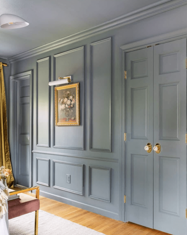
Traditional rooms often rely on contrast to define architectural elements. A colored wall might meet crisp white baseboards, white doors, white crown molding, and a white ceiling.
There is nothing wrong with that approach, but all of those transitions give the eye another place to stop.
Carrying a single color across walls, trim, doors, and millwork reduces those visual interruptions. Architectural elements begin to relate to one another rather than competing for attention, which can make the room feel quieter and more unified.
This approach can be particularly useful when a room has awkward transitions or architectural details that you do not necessarily want to emphasize. Rather than outlining every doorframe or molding with contrast, color can help those elements recede into the overall composition.
Color drenching can also:
Reduce visual clutter by limiting unnecessary contrast throughout the room.
Blur awkward architectural transitions and help disconnected elements feel more intentional.
Connect the ceiling more naturally to the rest of the space.
Create a quieter backdrop that allows artwork, furnishings, and decorative objects to stand out.
Give a room a more immersive and enveloping atmosphere.
The result does not necessarily feel like “more color.” In many cases, it simply feels like less visual noise.
Start With the Feeling, Not the Paint Chip
Before selecting a color, we like to begin with a different question:
How should this room feel?
Should it be calming? Energizing? Grounded? Intimate? Sophisticated?
The emotional experience of a room should help guide the palette rather than beginning with whichever shade happens to be popular at the moment.
Soft greens can feel restorative and connected to nature, while earth tones often introduce a greater sense of grounding. Blues can create a quieter, calmer atmosphere. Rich browns and burgundies bring warmth and intimacy, while warm neutrals can create an enveloping feeling without becoming particularly dramatic.
The room itself also needs to be considered. A color that works beautifully in a bright, south-facing room may behave very differently in a space with limited daylight.
That is why color should always be considered in context.
The Same Color Does Not Have to Mean the Same Finish
One of the easiest ways to give a color-drenched room dimension is through paint sheen.
Using the same color throughout does not require applying exactly the same finish to every surface. In fact, varying the sheen allows architectural details to remain visible while preserving the continuity of the palette.
We often like a matte finish on the walls, satin or semi-gloss on trim and doors, and a flat finish on the ceiling.
As light moves through the room, it reflects differently from each surface. Moldings, doors, and millwork retain their definition without requiring a contrasting color to outline them.
It is a subtle distinction, but it can make the finished room feel considerably more layered and sophisticated.
Light Still Matters
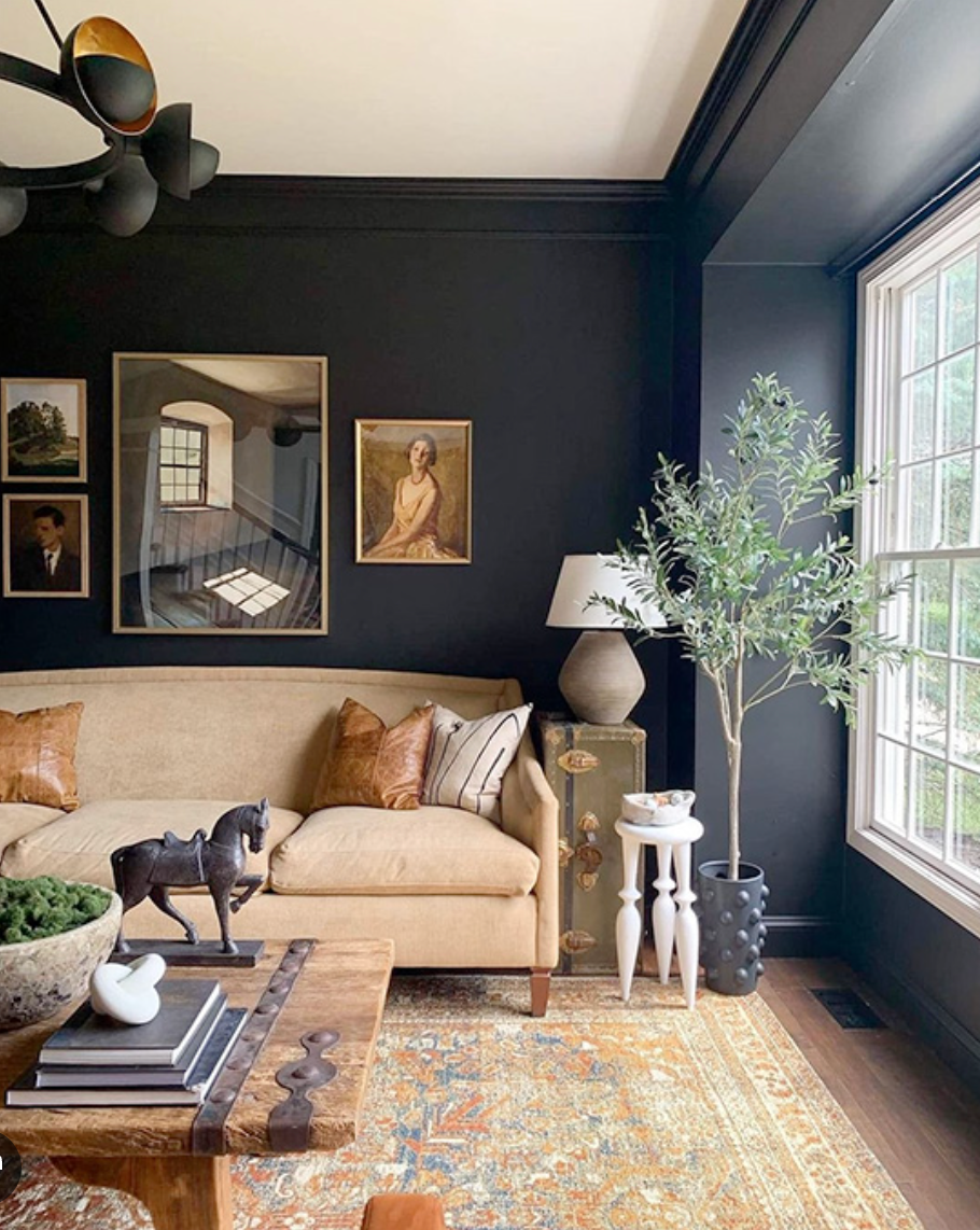
Color never exists independently from light.
Natural daylight changes throughout the day, and a paint color will change with it. Morning light may reveal undertones that are barely noticeable by evening, while artificial lighting can shift the color again once the sun goes down.
This becomes particularly important with color drenching because the shade occupies so much of the visual field.
Before committing to a color, we always recommend testing it in the actual room. Paint a generous sample rather than relying on a small paint chip, and look at it at different times throughout the day.
Also consider everything already present in the room. Flooring, windows, furnishings, natural light, and artificial lighting all influence how dark or saturated a color can comfortably become.
Common Color-Drenching Mistakes
Color drenching is relatively simple in concept, but a few decisions can dramatically influence the result.
Choosing from a small paint chip. A color viewed on a two-inch sample can look very different when it surrounds an entire room. Always test it at a larger scale first.
Ignoring daylight. Pay attention to how the room changes from morning through evening before making a final selection.
Assuming darker is better. A color-drenched room does not have to be dramatically dark. Consider the architecture, flooring, windows, and available light before deciding how saturated to go.
Using the same sheen everywhere. A single finish can flatten architectural details. Subtle changes in sheen create dimension while maintaining the cohesive effect.
Creating an Atmosphere, Not Following a Trend
Color drenching may be having a moment, but the principle behind it is much more enduring.
When unnecessary contrast is removed, a room can feel quieter and more cohesive. When color is selected according to the emotional experience we want to create, it becomes part of how the space supports us rather than simply how it looks.
That is ultimately what makes color drenching interesting to us.
It is not about covering every surface simply because it is popular. It is about using color intentionally to create a room that feels complete, immersive, and entirely its own.


Comments